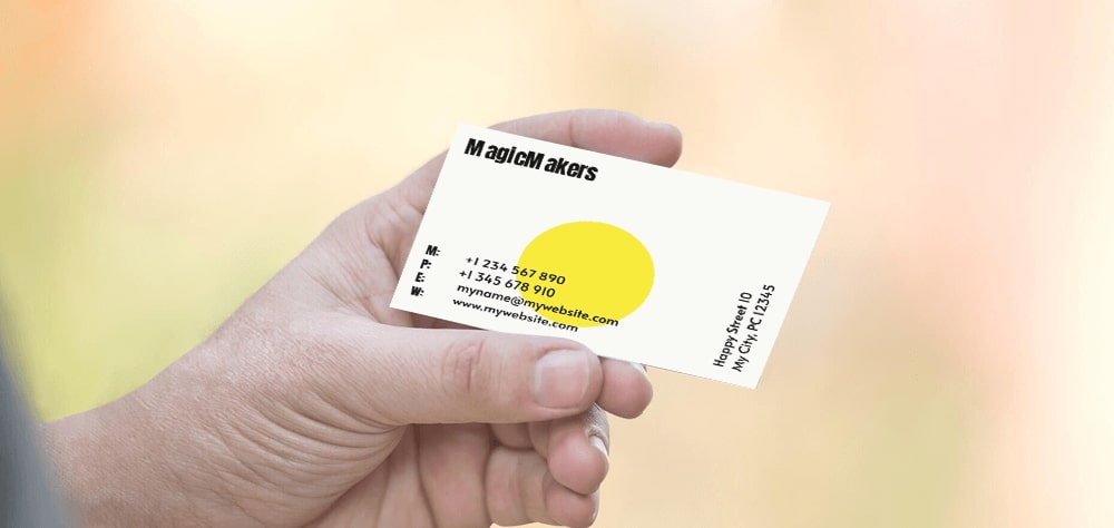
One of the first things you will hear, when starting your own business, is how crucial a good network is for achieving success. A business card can help you with this. This small little card is more than just a piece of paper with your contact information. It is basically your first impression. It has the possibility to create trust, show professionality and leave a lasting impression on the receiver of the card. Therefore, having a good business card is really important.

There is much to take into account when designing a business card and therefore it can be difficult to know where to start. Do not worry! In this blog, we will discuss the different components of the designing process and give tips along the way. At the end you will be a pro in designing your own business cards.
Tip #1 Think carefully about who your target audience is
The first question to ask yourself when designing your own business card is: to whom am I going to give my business card? Who is the target audience of the card? On which (social) platforms are they active? Once you have a clear picture of you target audience, you can use this to determine how your target audience wants to contact you. Do they prefer calling or sending an e-mail? What are they looking at first, your name or your position? Do they prefer colour and spontaneity or do they prefer a clear overview and are they straight-to-the-point? Once you know this, creating a design for your card will be much easier.
Tip #2 Make sure the design of the card fits what you are offering
An original and creative business card lasts much longer in someone's mind than one with a standard template. Look online and find inspiration, there is plenty of inspiration out there. Make a selection of 30 designs that appeal the most to you. Then, go through the 30 designs you have chosen and limit the amount to 10 of them. Eventually, halve this amount so you end up with 5 final designs on which you will base your own design. However, keep in mind that your design must match the services you offer. For example, a business card from a cake maker will look different from the business card from an IT developer. If you do not do this, there might arise uncertainty about which service you offer or your professionalism.
Tip #3 The correct design tools
Of course you will need a clear tool where you can design your business cards with ease. Tools that are often used by designers are Adobe Photoshop, InDesign and Illustrator. These applications are designed to deliver the best results. To prevent any mistakes from occurring, make sure you stick to the delivery specifications as stated on our website. In this blog, we explain to you how to deliver a printing file that suits all the specifications needed for the best result.
No experience with Adobe Photoshop, InDesign and Illustrator? No worries! On our website we offer our very own online editor. With our editor you are able to make the most beautiful and unique designs for your business cards. In this blog, we discuss how the online editor works step by step. Do you already know how to use editor? Choose your templates and quickly create your own business card.
Tip #4 What information should be on your business card?
A business card says a lot about who you are as a person and your business. The design of your business cards should convey your values and distinguish you from others. However, the written information on the card should above all be clear. Of course the written information on your card must contain the standard elements such as: name, position, e-mail, telephone number and possibly an address. But in what order? What font size? To find out, we look back at tip #1 Who is your target audience? What do they look at first and what can be of benefit for them? This can provide a lot of clarity for you.
Another thing to keep in mind is that all this information should be on one side of the card. Therefore you should keep it simple and only feature the most important information. The other side of the card offers you the chance to impress the receiver of the card. Use a fitting and captivating image, something that really fits your business, in combination with your name or the name of your business.
Tip #5 Choosing the right card size and type of paper
Knowing the size of your card is very important. Not only will it affect your font and pictures, but it’ll limit your workspace just as much. The standard format (85 x 55 mm) is the most common to be used. It is also the one we, HappyPrinting, offer on our website. But that is not all. We got rounded edges and folded cards as well! All of this should be kept in mind while designing your card. Choose your desired card.
Tip #6 Make sure your business card leaves a lasting impression!
A lot of the times when you have the opportunity to share your business card with someone, you are not the only one. Some people even leave with wallets full of them. How do you make sure that your business card stands out?
Beside making a unique design you can also choose for a different approach. For example, you can add a QR code with you information as a little twist, or fold lines that make a pretty flower if folded right. The possibilities are endless!

Happy Designing! Still having trouble? HappyPrinting is here to save the day! Contact us if you have any questions or need help with your design. We’re happy to help you.
Also, take a look at our other related blogs. It might help prevent disappointment!
We Print, You Smile!